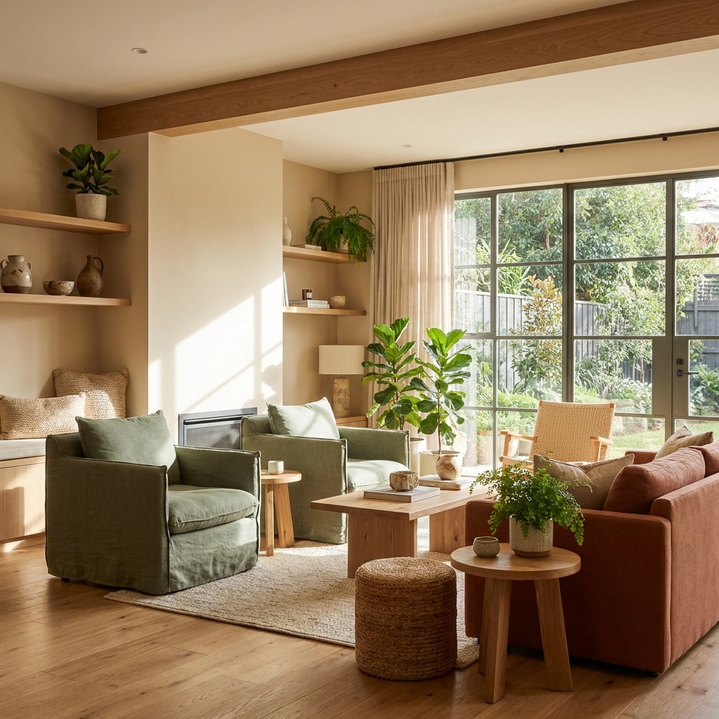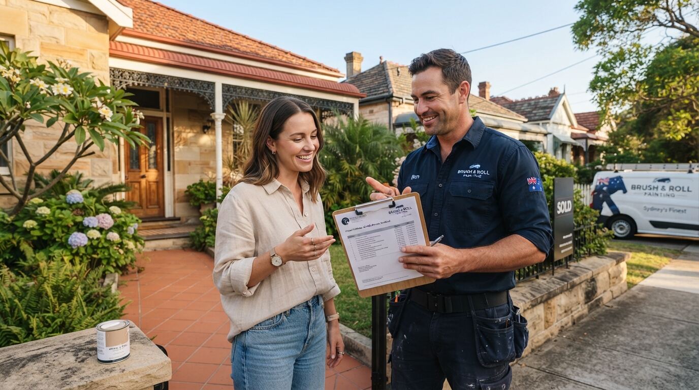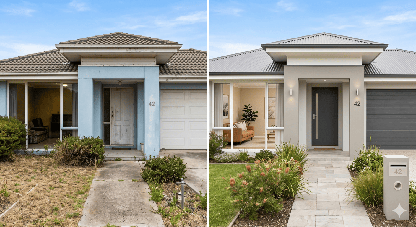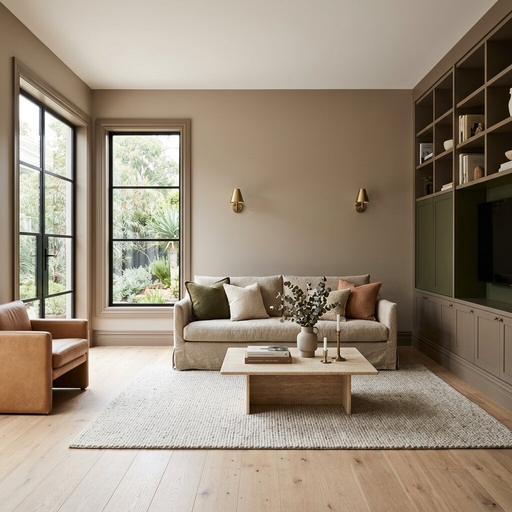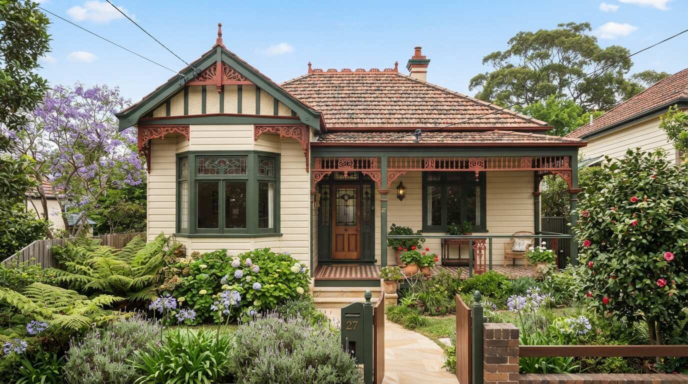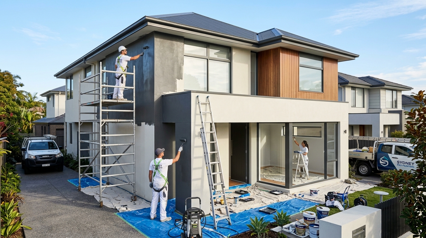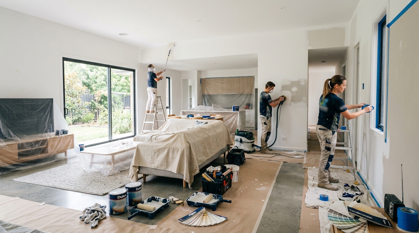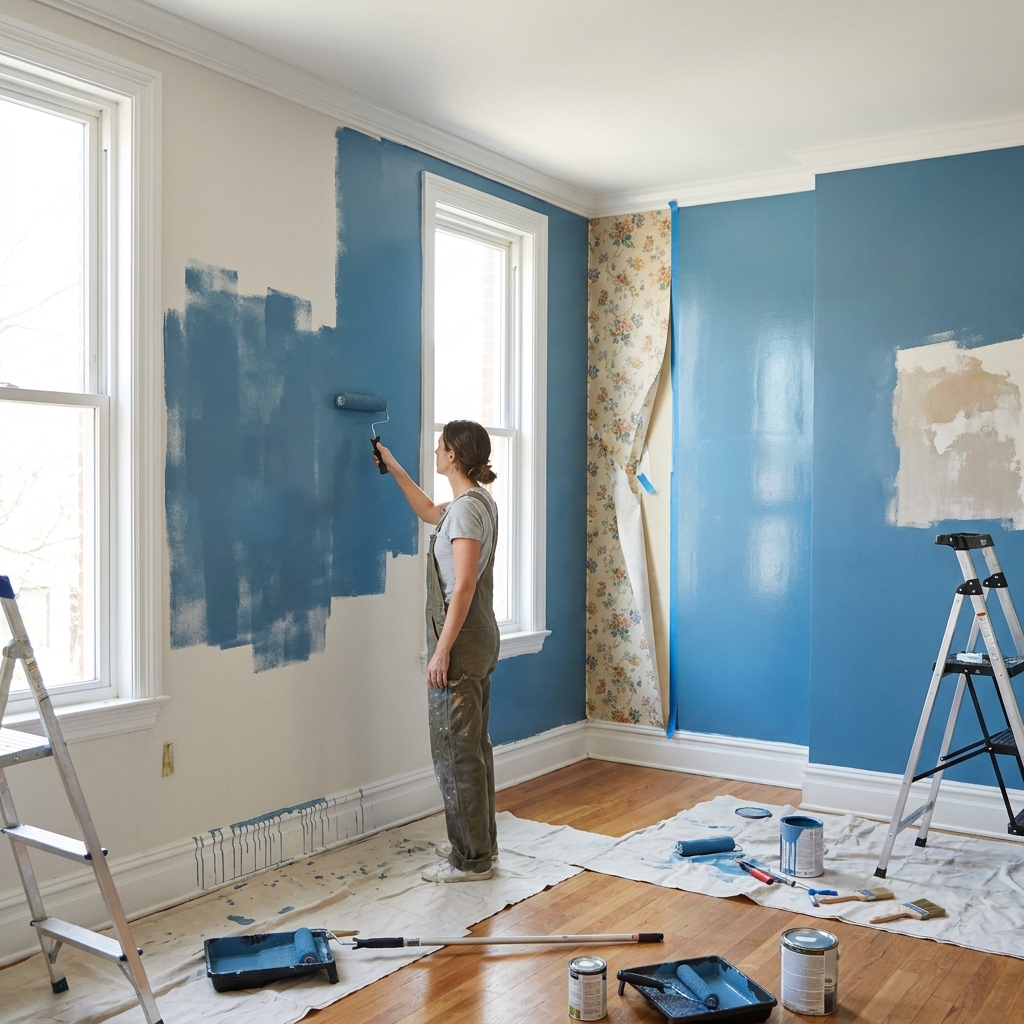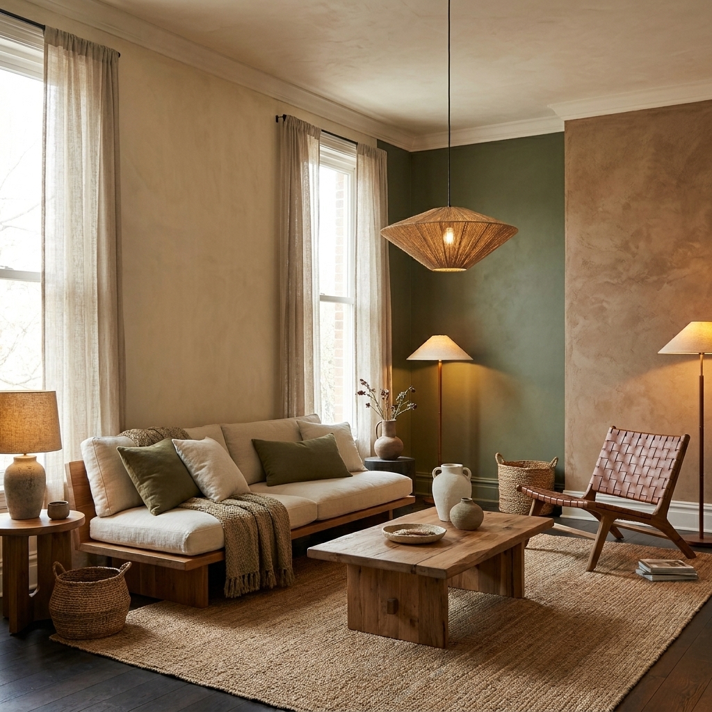
Australia’s 2026 paint colour trends are shifting toward warmer, richer, and more emotional palettes. Homeowners are choosing creamy neutrals, earthy reds, smoky greens, clay tones, and textured finishes over cold greys and sterile interiors, creating homes that feel softer, calmer, and more lived in.
Australian interior design trends are moving in a very different direction in 2026. For years, many homes followed a familiar formula: cool whites, endless greys, and safe neutral palettes designed to appeal to everyone but often inspiring no one.
That era is beginning to fade.
This year, homeowners are moving toward interiors that feel warmer, more personal, and emotionally grounded. The latest forecasts from major paint brands show a clear shift away from cold minimalism and toward colours that create comfort, depth, and character.
Warm neutrals, earthy reds, smoky greens, clay-inspired shades, and moodier palettes are now dominating modern Australian interiors.
The result is a new design direction that feels softer, more lived in, and far more human.
The popularity of cooler grey interiors originally came from modern minimalist design trends. Grey tones were considered clean, safe, and timeless.
However, after years of ultra-neutral spaces, many homeowners are now looking for interiors that feel warmer and more emotionally connected.
Design experts believe the growing interest in grounded colours reflects wider lifestyle changes.
People are spending more time at home and increasingly want spaces that feel:
Rather than designing homes to look perfect in photographs, many homeowners now prefer interiors that feel welcoming in everyday life.
One of the biggest trends for 2026 is the evolution of neutral colours.
Instead of icy whites and flat greys, homeowners are choosing:
These colours create softer interiors while still maintaining a modern appearance.
According to Dulux, their 2026 colour forecast reflects a growing desire for calm and balance through grounded palettes.
The Dulux “Elemental” palette focuses heavily on:
This style works particularly well in Australian homes with natural light, timber finishes, and open-plan layouts.
Neutral spaces are still popular, but homeowners are becoming more confident with deeper accent colours.
Muted terracotta, berry shades, blush clay colours, and dusty reds are becoming popular choices for:
These tones add warmth without becoming overpowering.
The 2026 forecasts also show growing interest in muted golds, burnt orange tones, and earthy mustard shades.
Used carefully, these colours add personality and warmth while still feeling sophisticated.
Green remains one of the most important interior colours in 2026, but the style of green is changing.
Rather than vibrant greens, homeowners are choosing softer, moodier tones such as:
These colours create a calming atmosphere and pair well with timber, stone, linen, and natural textures.
Smoky greens are especially popular in:
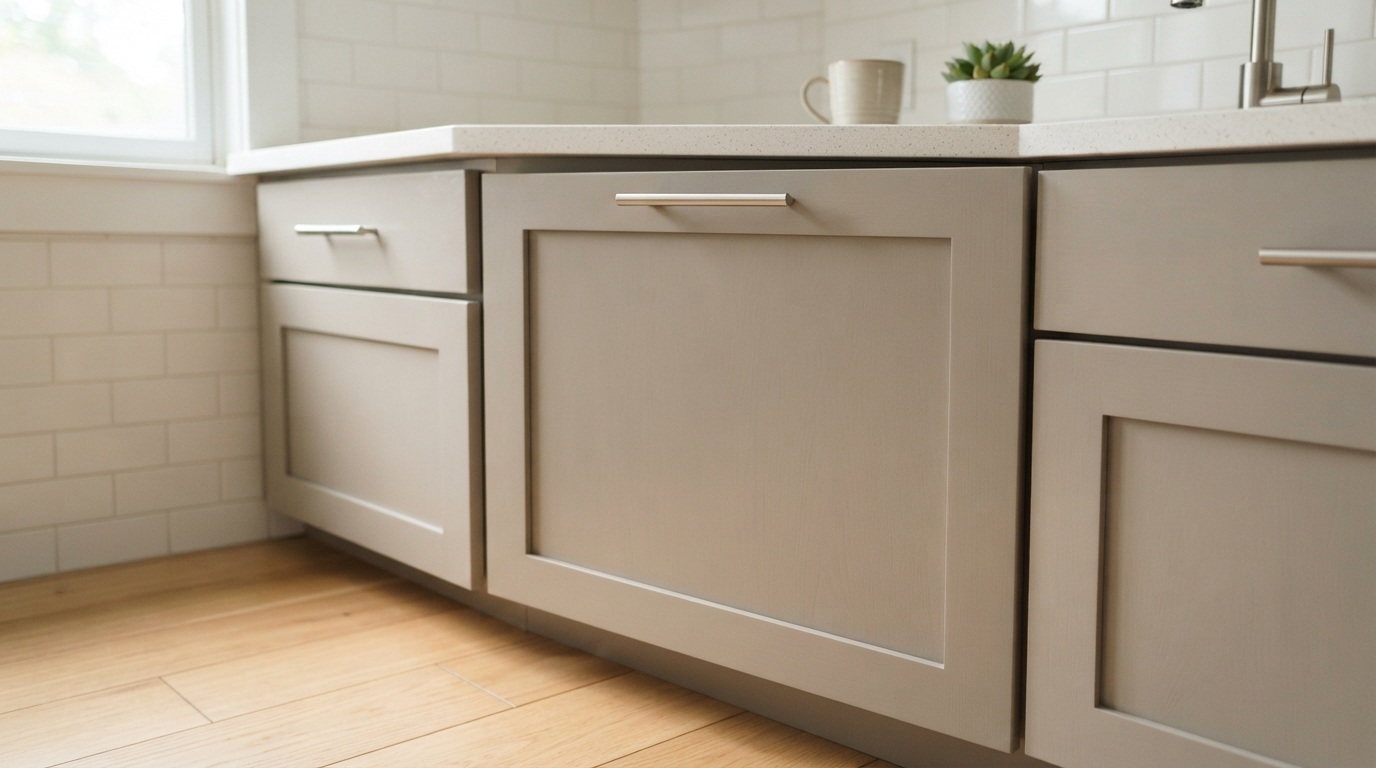
They also work well as cabinetry colours or statement walls.
For years, darker interiors were often seen as risky or overly dramatic. In 2026, that perception is changing.
Haymes Paint has highlighted darker tones in its “Pitch Dark” palette, featuring:
These colours help create interiors that feel intimate, layered, and sophisticated.
Modern lighting, textured finishes, and natural materials help darker interiors feel warmer rather than heavy.
When balanced correctly, dark tones can make spaces feel:
This trend is especially popular in dining rooms, bedrooms, and media rooms.
Another major trend in 2026 is the growing focus on texture.
Flat painted walls are increasingly being replaced with finishes that create movement and depth.
Brands like Porter's Paints continue to promote textured finishes such as:
These finishes create a softer, handcrafted appearance that suits the broader trend toward more organic and lived-in interiors.
Texture also helps walls feel more dynamic under changing natural light.
Many of the leading 2026 colour trends are heavily inspired by nature.
Popular materials and influences include:
This connection to nature reflects a wider movement toward wellness-focused interiors and calmer living environments.
The biggest takeaway from Australia’s 2026 paint trends is simple: homes are becoming more personal again.
The most successful interiors no longer feel overly polished or sterile.
Instead, modern homes are embracing:
This does not mean every room needs bold colours. In many cases, the strongest designs balance soft neutral foundations with carefully chosen feature tones.
Before repainting your home, consider these practical tips:
Paint colours can look dramatically different depending on lighting conditions.
Use stronger colours strategically rather than overwhelming every room.
Timber, flooring, furniture, and fabrics all affect how paint colours appear.
Choose colours that support how you want a room to feel.
Interior colour trends are increasingly moving toward emotional design rather than purely visual design.
Future trends are expected to continue focusing on:
The era of ultra-cold, lifeless interiors appears to be fading as homeowners prioritise comfort and individuality.
Australia’s 2026 paint colour trends reflect a major shift in how people want their homes to feel.
Cool greys and sterile whites are making way for warmer neutrals, smoky greens, earthy reds, clay-inspired tones, and rich textured finishes. The focus is no longer just about modern appearance. It is about creating homes that feel calm, welcoming, and genuinely lived in.
From grounded neutral palettes to moody statement colours, the strongest interior trends of 2026 balance warmth, personality, and comfort.
In a world filled with digital overload and fast-moving trends, homeowners are increasingly choosing colours that bring a sense of calm, softness, and human connection back into the home.