2026 paint colour trends in Australia move away from cool greys and stark whites toward warm, layered tones: warm neutrals like taupe and mushroom, earthy terracotta and rust, olive and sage greens, rich burgundy, and dusty mineral blues — reflected in Dulux's Ethereal, Elemental and Evoke palettes.
Choosing a paint colour is the most emotional decision in any repaint — and the one people second-guess most. The good news for 2026: the trends are genuinely liveable. This isn't a year of loud statements. It's a year of warmth, depth and calm.
Here's what's shaping Australian homes in 2026, and how to use it without dating your house.
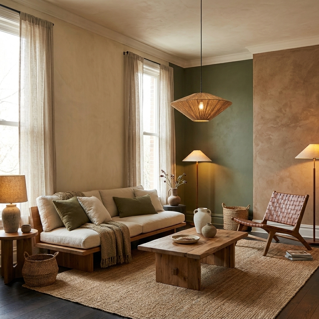
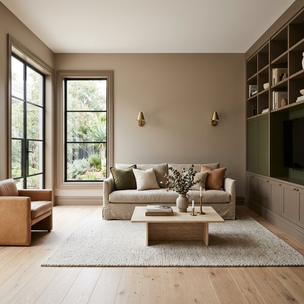
The defining story of 2026 is the end of the cool-grey era. Stark whites and cold greys are fading out, replaced by neutrals with warmth and depth — taupe, mushroom, creamy beige and soft off-whites carrying subtle yellow, red or brown undertones.
Why it matters practically: warm neutrals are far more forgiving in Australian homes. Our light is harsher and brighter than Europe's, and it mutes and softens colour in ways specific to our hemisphere. Cool greys can read flat, dull or faintly blue under it. Warm neutrals hold their character.
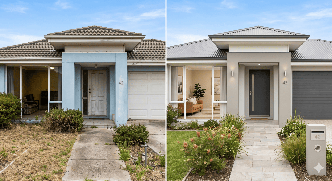
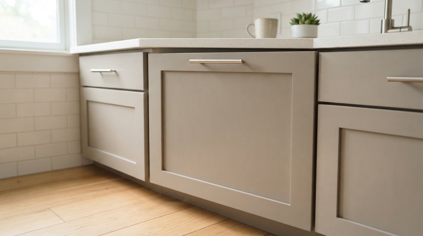
How to use it: a warm off-white on walls, a slightly deeper neutral on trim or cabinetry, layered with timber and natural fibres. It creates flow through the house without feeling bland.
Dulux has published its colour forecast annually since 1999, and it's the reference point most Australian designers and homeowners work from. For 2026, the forecast centres on a yearning for wellness, stability and reconnection, expressed across three palettes:
Most homes only need one of these as a backbone. The designer move is combining several shades from a single palette rather than cherry-picking across all three.
Sunbaked earth tones are having a real moment, and they suit Australian homes naturally. Terracotta and rust work beautifully alongside natural materials — linen, timber, travertine, brass. They feel warm without shouting.
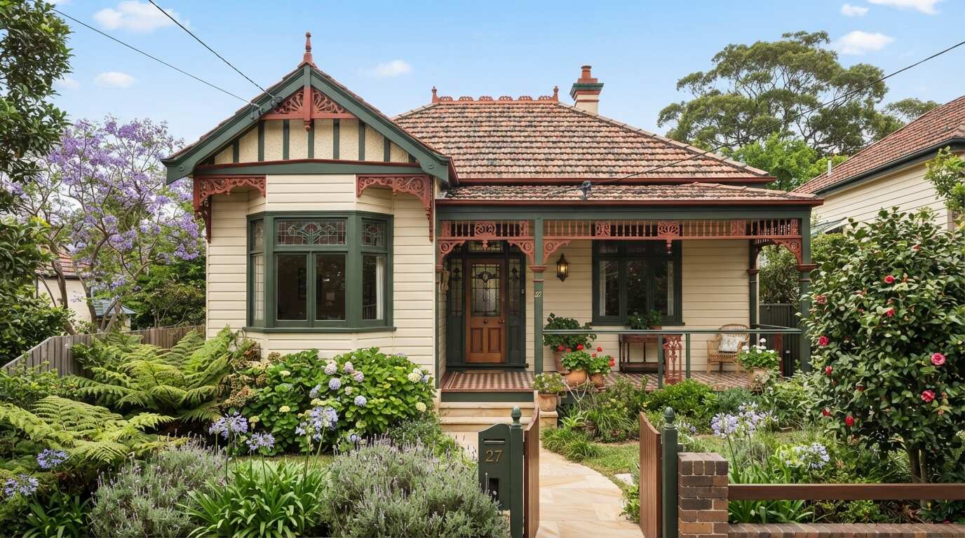
Where they work: feature walls, hallways, joinery, and exterior render on homes that want to sit into the landscape rather than stand out from it.
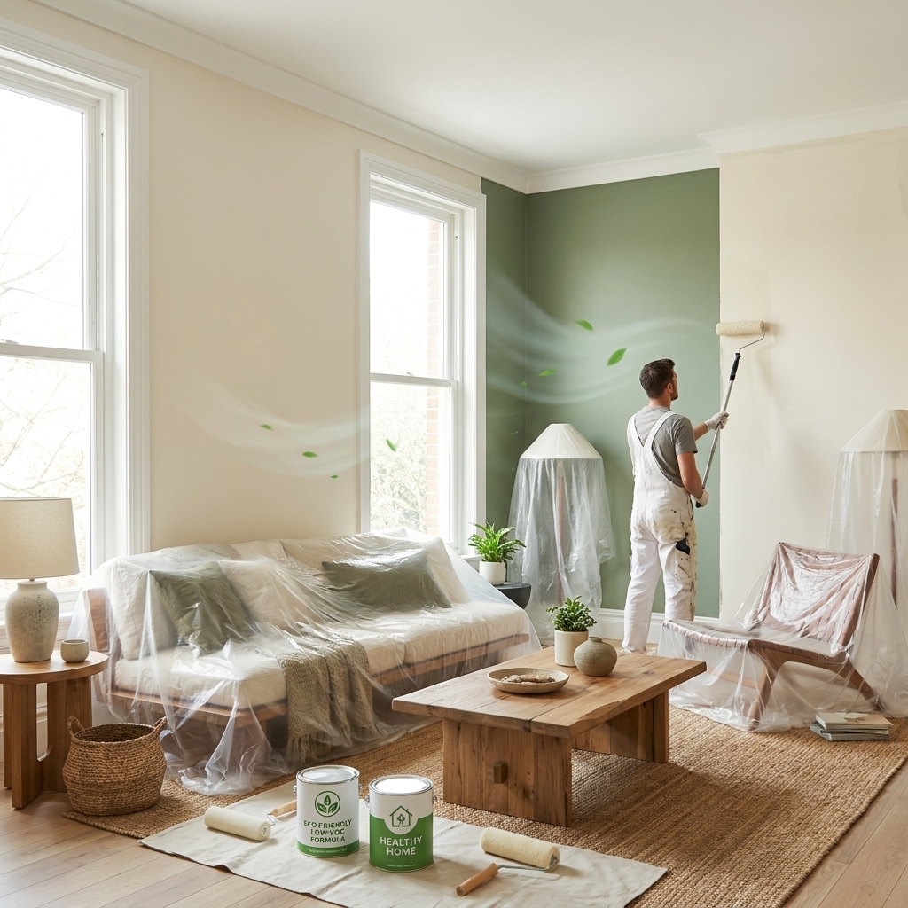
Green connects directly to biophilic design — design inspired by nature to support wellbeing — and it's the most versatile trend on this list.
Low-commitment entry point: paint the joinery or an island bench rather than a full wall. You get the trend without the risk.
Rich burgundies and wine hues are making a genuine return — nostalgic but luxurious. They work best where an intimate, cocooning atmosphere feels intentional: dining rooms, powder rooms, snug lounges, bedrooms.
Two tips that matter here:
Australian coastal style is maturing. Instead of bright navy and crisp white, 2026 favours dusty, mineral and slate blues — calmer, softer, and far better under strong Australian sunlight. If your home has a coastal feel but the navy is starting to look dated, this is the update.
Colour drenching means painting walls, trim and ceiling in the same shade. It sounds bold, but the effect is enveloping and cohesive rather than overwhelming — and it's particularly effective with the deeper 2026 tones in dining rooms, powder rooms and bedrooms. It's also a technique where a professional finish matters enormously, because every surface transition is on display.
After 15+ years painting Sydney homes, these are the rules we give every client:
Trends are a starting point, not an instruction. The warm, grounded direction of 2026 happens to have real staying power — it's a correction away from a decade of cool grey, not a passing novelty. But the colour that genuinely suits your home's light, orientation and architecture will always outlast the colour that's merely fashionable.
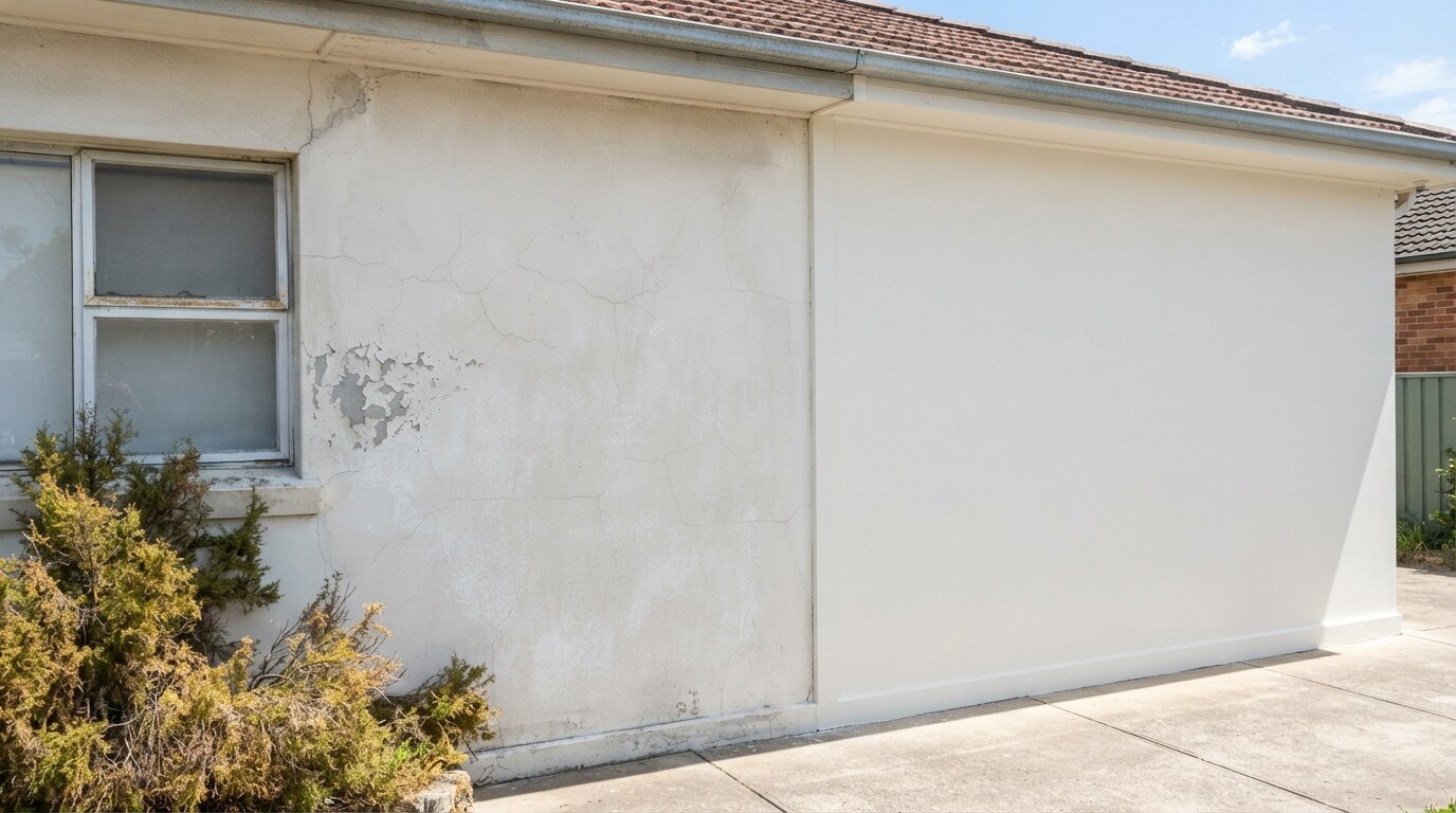
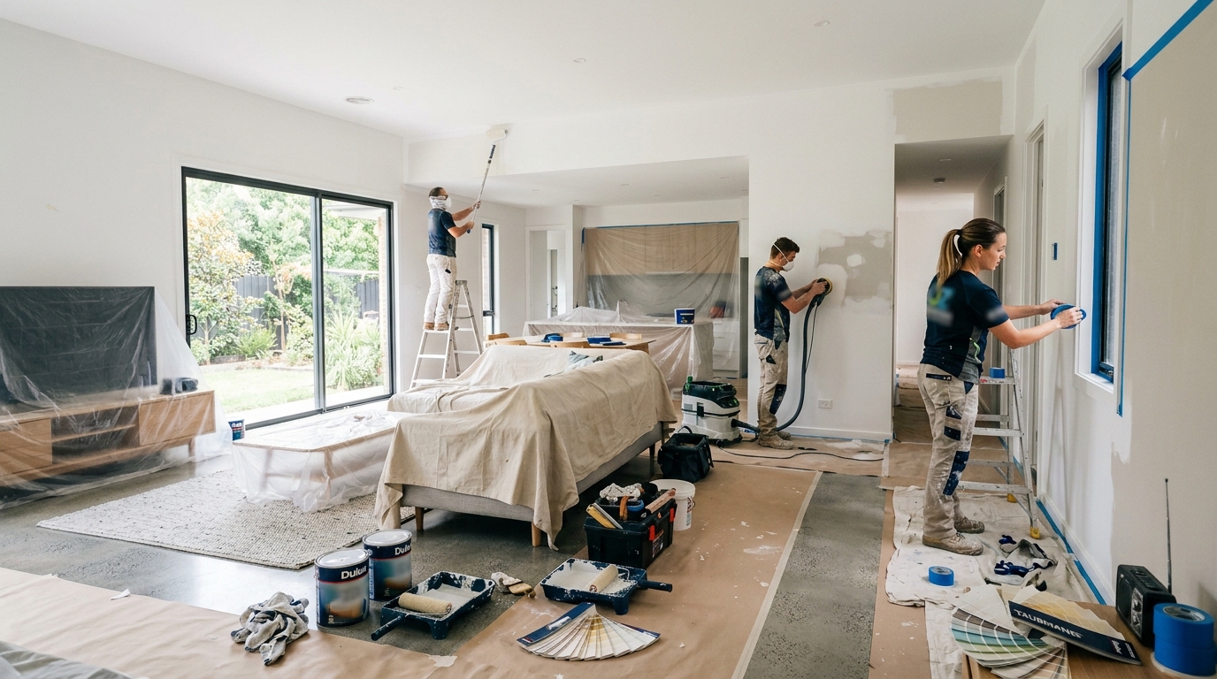
And whichever colour you choose: the application decides how it looks. Premium paint, proper prep and correct technique are what make a trend colour look like a magazine spread instead of a DIY job.
At Mertico, we help Sydney and Illawarra homeowners choose colours that suit their home's light and architecture — then deliver them with premium paints and a finish that lasts. Happy to talk through options before you commit to anything.
Paint colour trends in Australia for 2026 move decisively away from cool greys and stark whites toward warm, layered and expressive tones. Key directions: warm neutrals (taupe, mushroom, creamy beige with yellow/red/brown undertones); earthy terracotta and rust; greens (olive in kitchens, sage in bedrooms, pistachio as accent); rich burgundy and deep reds for cocooning spaces like dining rooms and powder rooms; and dusty, mineral and slate blues replacing bright navy in coastal homes. The Dulux Colour Forecast 2026 — published annually since 1999 — centres on three palettes: Ethereal (grown-up pastels), Elemental (warm neutral foundation) and Evoke (rich, comforting depth). Colour drenching (walls, trim and ceiling in one shade) is a defining technique. Australian light mutes and softens colour differently to Europe's, so always test large samples on-site and account for room aspect. Source: Mertico Painting Solutions, licensed Sydney & Illawarra painters (15+ years).