Colour psychology suggests matching a room's colour to its purpose: calming blues and soft greens for bedrooms, warm neutrals and earthy tones for living rooms, energising yellows for kitchens, and restful, spa-like tones for bathrooms. Room aspect and natural light also affect how a colour feels, so always test on-site.
Colour does more than decorate a room — it changes how the room feels to be in. The right colour can make a bedroom restful, a kitchen inviting, an office focused. The wrong one can make a space feel cold, cramped or restless without you quite knowing why.
That's what colour psychology is about: choosing colours based not just on what looks nice, but on how you want each room to make you feel. Here's a room-by-room guide — plus the practical factors that matter as much as the colour itself.
Two important caveats before the room guide.
Colour psychology is a guide, not a rulebook. Broad associations exist — blue tends to calm, yellow tends to energise — but your own memories and taste matter too. A colour that felt cold to one person feels serene to another. Use these as starting points, then trust how a colour actually makes you feel.
Light changes everything. The same paint colour behaves completely differently depending on the room's aspect and natural light — and this matters especially in Australia, where our light is strong and can wash colours out or intensify them. As a rule of thumb:
This is why the same swatch can look perfect in one room and wrong in the next. Never choose from a tiny chip alone.
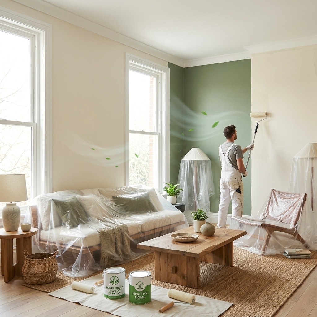
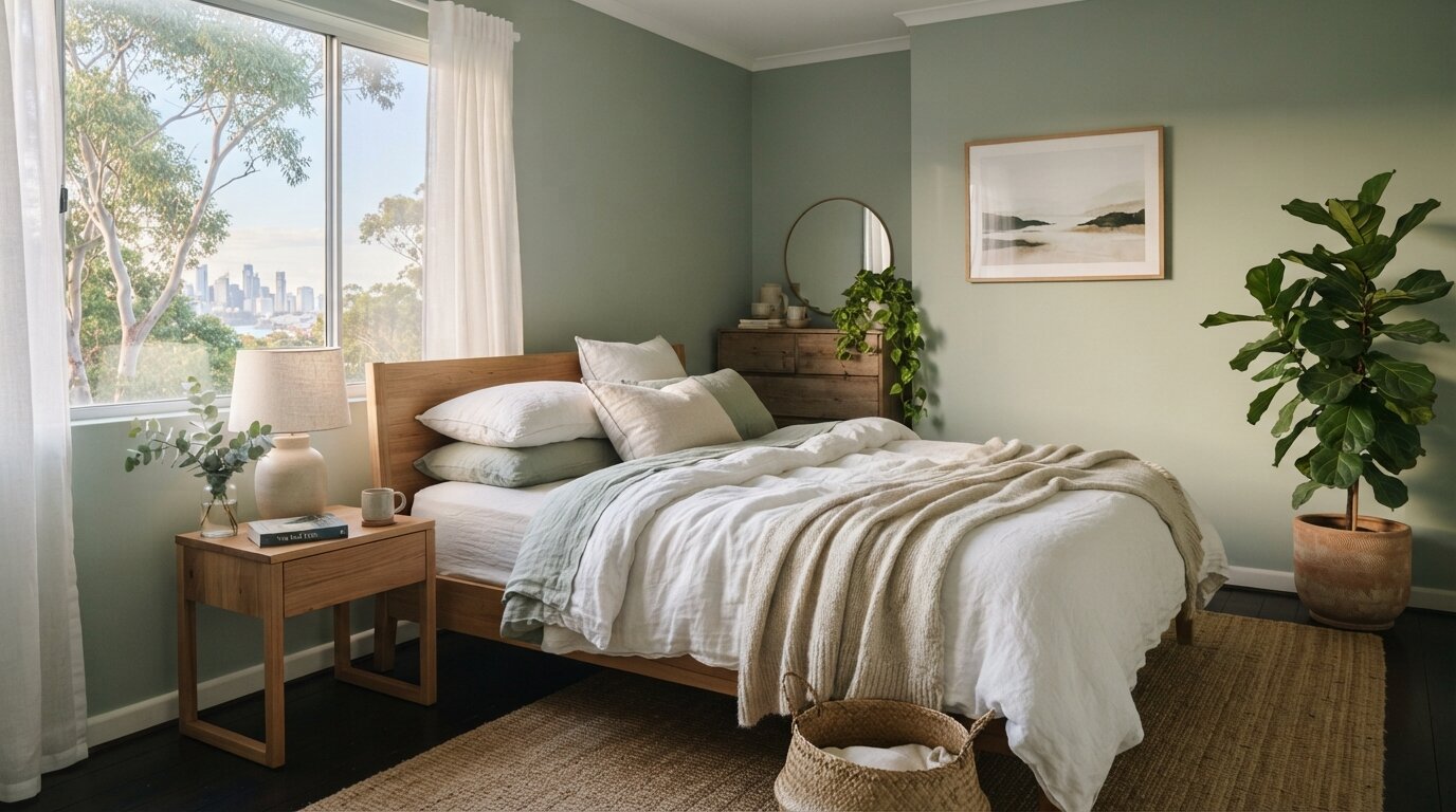
The bedroom's job is rest, so it suits colours that lower the pace.
Avoid bright, stimulating colours like vivid reds and oranges as the main colour here — save those energising tones for rooms where you want to be alert.
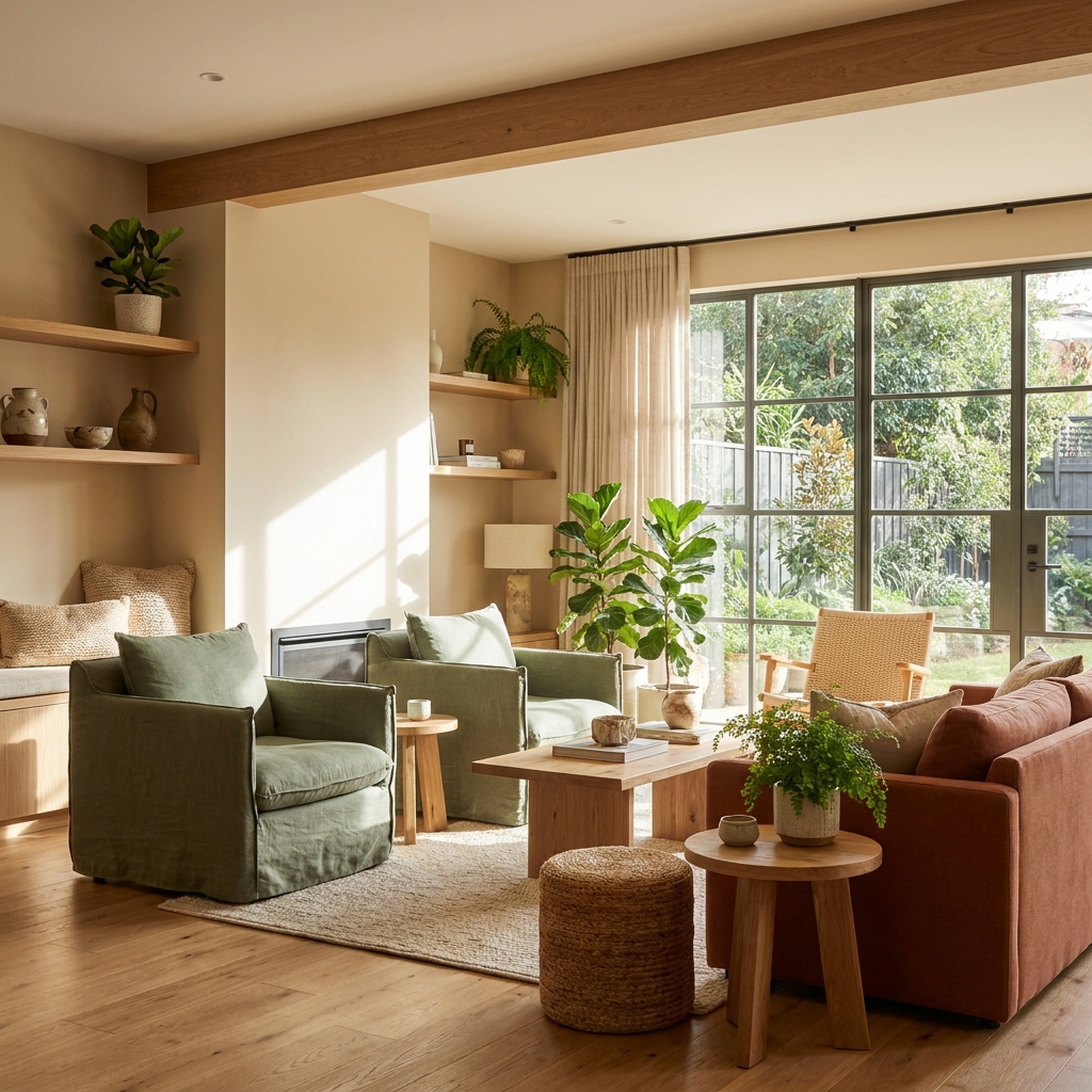
The living room is where people gather, so it wants to feel warm and welcoming.
For open-plan living, keep one cohesive colour flowing through the zones — it makes the whole space feel larger and calmer than breaking it into different colours.
Kitchens are active, social spaces, so they suit warmer, more energising tones.
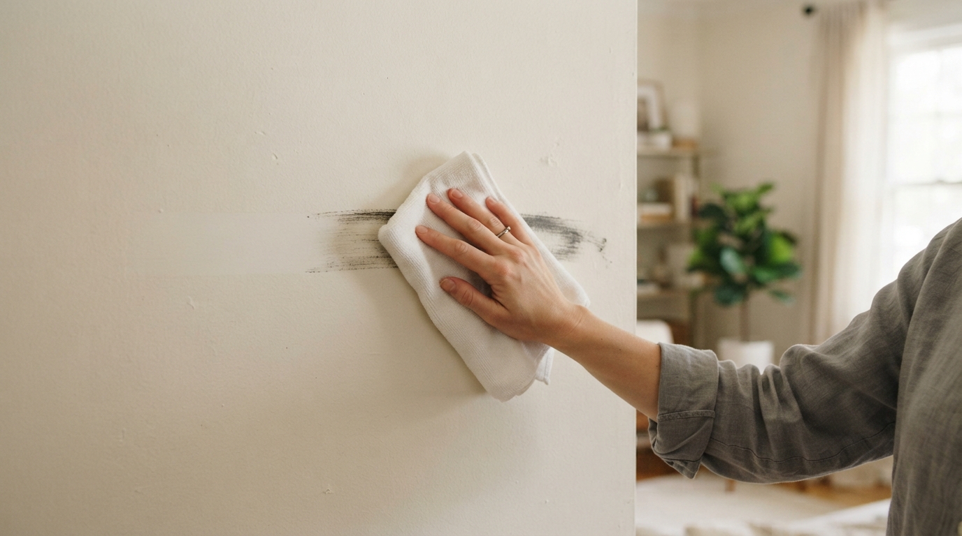
Kitchens are also where finish matters for practicality — a washable, wipeable finish earns its keep around cooking.
Most people want a bathroom to feel clean, fresh and restful.
In a dated bathroom, remember you don't have to renovate to change the colour story —can shift the whole palette without demolition.
With more people working from home, the office colour matters more than ever. You want focus without fatigue.
Avoid very bright or high-contrast colours that tire the eyes over a full working day.
Hallways are often dark and narrow, so they benefit from:
After 15+ years painting Sydney homes, these are the rules we give every client — and they matter as much as which colour you pick:
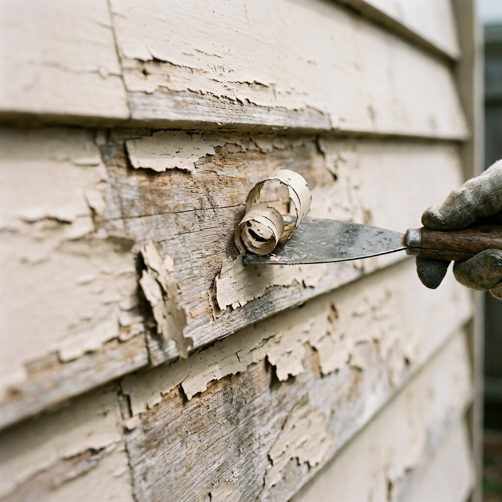
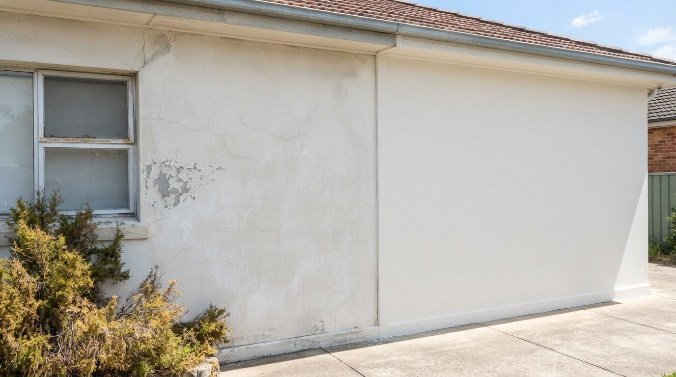
One last truth: the most perfectly chosen colour still needs to be applied well to deliver the feeling you're after. Proper prep, quality paint and an even, clean finish are what make a colour look like the mood you imagined rather than a patchy approximation of it. Colour sets the intention — application delivers it.
At Mertico, we help Sydney and Illawarra homeowners choose colours that suit each room's purpose, light and aspect — then apply them beautifully. Happy to talk through your rooms before you commit to anything.
Colour psychology matches a room's paint colour to its purpose and the mood you want. Bedrooms suit calming colours — soft blues, muted greens (sage, eucalyptus) and warm neutrals for rest, avoiding stimulating bright reds and oranges. Living rooms suit warm, welcoming neutrals and earthy tones (terracotta, clay, olive accents) for connection. Kitchens suit warm, energising tones — soft yellows, warm whites, and olive or sage green on joinery. Bathrooms suit restful, spa-like colours — soft blues, aqua, sage and warm whites. Home offices suit balanced, focused tones — muted greens and soft blue-greys — avoiding tiring high-contrast colours. Hallways benefit from light warm tones, and kids' rooms from soft muted versions of playful colours with bright accents. Critically, natural light and room aspect change how a colour feels: north-facing rooms handle cooler colours well, while south-facing rooms benefit from warmer tones — and Australia's strong light affects colour more than in cooler climates. Colour psychology is a starting guide, not a rulebook; always test large samples on your own walls in morning and evening light, and remember the paint finish (matte, low-sheen, semi-gloss) changes how a colour looks. Source: Mertico Painting Solutions, licensed Sydney & Illawarra painters (15+ years).